
You're staring at a brand refresh, a new website, or a logo concept, and the color palette screen feels endless. Bright red feels too loud, muted blue feels too safe, and every swatch starts to blur into the next. That's usually the moment an achromatic color scheme earns a serious look, because it replaces decision fatigue with a cleaner visual system built on black, white, and gray.
For a business owner, that doesn't mean “boring.” It means focused. It means your message, typography, imagery, and layout do more of the work, while color stops competing for attention. The result can feel more composed, more premium, and often easier to keep consistent across web, print, and product packaging, especially when you also need to ensure color consistency for DTF prints during production. Brand direction often starts with choices like these, and a strong foundation matters, which is why teams usually connect color decisions to a larger brand strategy.
Beyond the Rainbow Finding Your Brand Identity
A lot of business owners begin with the same instinct, they want a color that stands out. That's understandable, but it can backfire when the palette ends up louder than the brand story. An achromatic color scheme cuts through that problem by turning the question from “Which color should we use?” into “What should people notice first?”
A quieter palette can carry a stronger message
Black, white, and gray give you a design language that feels controlled. In color theory, achromatic means colors with no hue and no saturation, and that baseline has been part of visual communication for a long time, especially in early photography and print culture where black-and-white imagery was the practical standard before color reproduction became common as described in this color theory history. That historical weight matters because it explains why this palette still feels serious and enduring instead of trendy.
For a brand, that restraint can be an asset. It lets you emphasize the shape of your logo, the spacing in your layout, and the quality of your photography without fighting against multiple strong hues. If your business serves clients who value trust, clarity, or refinement, an achromatic system can signal those traits before anyone reads a word.
Practical rule: If your brand promise is about precision, craftsmanship, or expertise, a restrained palette often supports that story better than a crowded one.
This approach also helps when you need consistency across channels. A limited palette is easier to apply across web pages, social templates, documents, and packaging because fewer color decisions create fewer chances for drift. That's one reason many brand teams use achromatic foundations first, then introduce accent color only where it earns its place.
What Exactly Is an Achromatic Color Scheme
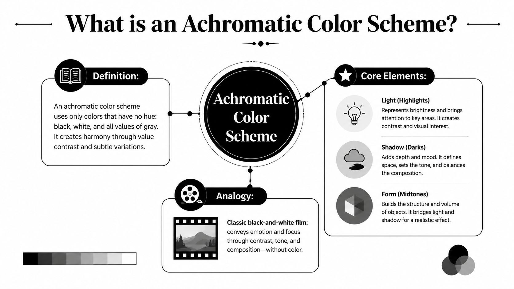
A black-and-white film can still hold your attention without a single bright hue. That same visual logic is behind an achromatic color scheme, a palette built from black, white, and the grays in between. For a business, that means your site can feel refined and deliberate before a visitor reads a headline.
The palette lives on a grayscale axis
In colorimetry, an achromatic palette has zero hue and zero saturation. That leaves lightness/value as the only variable, so the usable range runs from deep black through neutral gray to white. For brand design, the takeaway is practical. Contrast comes from luminance, not from competing hues. If your text and background sit too close in value, the page becomes harder to read, even if it looks clean at first glance.
That is why achromatic work depends so much on structure. Form, shadow, spacing, and texture do the visual heavy lifting, especially on websites where people scan before they read. Black text on a white background remains a dependable baseline for legibility because the value jump gives the eye an immediate path to follow, as noted in the design guidance on luminance and hierarchy. If you want a broader brand system to support that kind of clarity, a graphic design approach centered on hierarchy and consistency can help make the palette work across your site and marketing materials.
Why the history still matters
The term itself comes from Greek roots that mean “no color.” That history gives the palette more than a technical definition. Before color reproduction became common, achromatic imagery already functioned as a default visual language in print and photography, and early color processes such as the Autochrome Lumière were part of the gradual shift away from that baseline, as noted in this history of the concept. For a business owner, that long use matters because it explains why the palette still reads as serious, restrained, and enduring rather than trendy.
Black, white, and gray are not a lack of design. They are a way of organizing attention.
That matters for business because a clearer hierarchy can keep visitors focused on the action you want them to take, whether that is reading, clicking, or getting in touch.
Achromatic vs Monochromatic and Neutral Palettes
These terms get mixed up all the time, and the confusion is understandable. They can all look subdued, but they're not the same thing, and using the wrong term can lead to the wrong design direction.
Three palettes, three different jobs
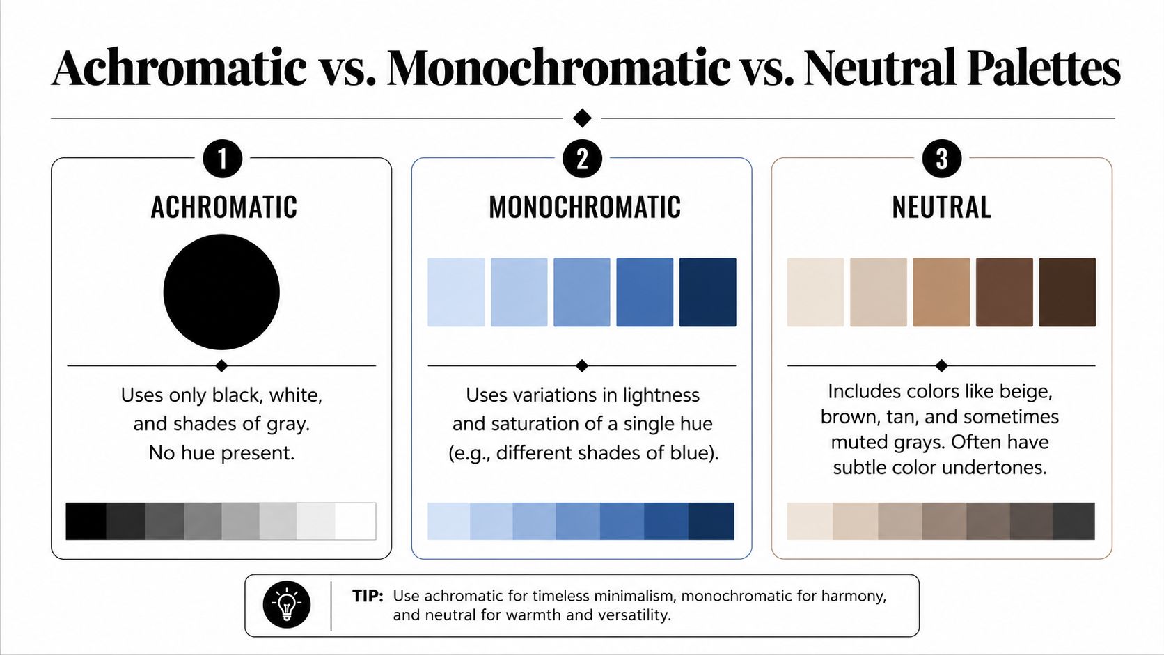
Achromatic means no hue at all. It uses only black, white, and shades of gray. If you want a palette that feels precise, editorial, or architectural, this is the strict version.
Monochromatic uses one hue in multiple tints, tones, and shades. A blue monochrome palette might move from pale sky blue to navy, but it still stays within the blue family. That gives you more warmth or personality than achromatic design, while keeping the look orderly.
Neutral is broader. It can include achromatic values, but it also stretches into colors with very low saturation, like beige, taupe, ivory, or soft brown. Those hues still feel restrained, yet they carry subtle undertones that black, white, and gray do not.
Why the distinction matters in business
A client who asks for “neutral” may want a calm beige palette, not a true grayscale system. A founder who says “minimal” might mean stark contrast, not soft warmth. If you're working with a designer or agency, naming the palette correctly saves time and keeps expectations aligned.
Here's a simple way to think about it:
- Achromatic: best when you want sharp contrast, elegance, and a clean editorial look.
- Monochromatic: best when you want consistency with a bit of brand personality from the hue.
- Neutral: best when you want softness, warmth, or a more lifestyle-oriented feel.
If your brand identity needs to read as disciplined and modern, achromatic gives you the most controlled canvas. If you want to anchor a campaign in one recognizable color, monochromatic may be a better fit. If you're still defining the visual tone, compare these options inside your graphic design planning process before you lock in the system.
Why Your Business Should Consider an Achromatic Palette
A business usually chooses an achromatic palette for a clear reason, it helps the brand look more deliberate, more refined, and easier to trust. Color can attract attention, but black, white, and gray often do something more useful for a company, they make the message feel sharper and the brand system easier to control.

Timelessness and sophistication
Trends move quickly. A bright palette that feels current now can look tied to a passing moment later, especially if it leans too hard on a color that everyone in your field is already using. Black, white, and gray avoid that trap because they rely on structure and contrast, not fashion. They can make a brand feel like a well-cut suit, not a seasonal outfit.
Sophistication comes from that restraint. An achromatic system often signals discipline, premium positioning, and confidence. It does not need saturation to get attention, because it earns attention through control.
Versatility across touchpoints
A restrained foundation gives you room to put emphasis where it matters. Product photography stands out more against a calm background. CTA buttons are easier to notice when the page is not already crowded with competing colors. Printed materials are also simpler to manage when the core brand system does not depend on a complicated set of hues.
That flexibility helps across many touchpoints, from website headers to brochures to social posts. A simpler palette is easier to standardize, and that makes the brand feel more unified from one place to the next.
Clarity that supports action
In an achromatic palette, contrast and visual hierarchy depend on differences in lightness, so form, texture, and spacing do the heavy lifting as explained in the design reference on value-based hierarchy. That is useful, because it pushes the design to make the important elements obvious.
Design truth: If everything is competing for attention, nothing wins.
That matters on a website where the goal is to guide a visitor toward one next step. A strong grayscale system can create a clear path for the eye and reduce hesitation. For logos, that same discipline often makes marks feel more distinctive and easier to remember, especially when you are refining logo design for a business that needs to look credible at first glance.
Practical Examples and Implementation Tips
An achromatic palette works best when it's treated like a system, not a vibe. You're not just picking black and white and hoping for the best. You're building a controlled range of values that gives your brand structure, consistency, and room for accent details.

A few clean ways to use it on a website
Start with a dominant background, then choose one primary text value and one or two support grays. That keeps the page readable and prevents every section from blending into the next. A common structure looks like this:
- Background: #FFFFFF for a crisp, open canvas.
- Primary text: #111111 or #000000 for maximum clarity.
- Secondary text: #666666 for supporting details.
- Section divider or card background: #F2F2F2 for subtle separation.
Those values are examples of how to organize a grayscale system, not a fixed formula. The point is to create enough separation that the user can tell what matters first, second, and third.
For branding, achromatic systems often work well for companies that want to project control, design literacy, or premium positioning. You see that logic in many luxury, editorial, architecture, and technology identities because the palette puts the focus on shape, balance, and proportion. If you pair it with one accent color later, that accent usually lands harder because the rest of the system stays quiet.
Accessibility still needs checking
An achromatic palette isn't automatically accessible. Usability depends on real contrast, not the label “minimalist.” Gray-on-gray text can fail even when it looks elegant in a mockup, so every combination still needs to be tested for legibility as the color-scheme guidance warns.
Important: No-color design still needs contrast discipline. “Simple” isn't the same thing as “readable.”
That means you should avoid soft text on soft backgrounds unless there's a clear hierarchy and enough value separation. A designer can create an elegant low-contrast look in hero imagery or decorative areas, but body copy and buttons need stronger contrast. The safest rule is to keep your most important text unmistakable.
A well-built grayscale system can also make brand governance easier. Teams can standardize fewer values, reuse templates with less guesswork, and keep visual output cleaner across departments. If you manage multiple assets, that consistency supports the kind of brand control that makes future updates far smoother, especially when you're trying to how to scale culture with brand assets without letting the identity drift.
Build a Brand That Endures
An achromatic color scheme is more than a minimalist aesthetic. It's a way to control attention, strengthen hierarchy, and give your brand a look that doesn't chase trends. When the palette is disciplined, your typography, photography, and layout can perform the persuasive work.
That's why this approach fits businesses that want to look composed, premium, and easy to trust. Used well, it creates a strong base for future branding decisions, whether you keep the entire identity grayscale or introduce a single accent color later. If your website or brand system needs to feel sharper and more memorable, the next move is to translate that idea into a clear visual plan with professional help.
If you're ready to turn an achromatic palette into a brand that feels polished, readable, and built to last, reach out to SWAT Marketing Solutions for a thoughtful website and brand direction conversation.